Web Design Trends For 2017
03 February 2017
The web design landscape is like humanity itself, it's constantly changing and evolving. What yesterday was once considered as fresh and modern can appear as outdated and boring seemingly overnight, ending up being dismissed as passé.
Today we have prepared for you 7 trends in web design that are guaranteed to keep your website looking fresh and help you pop among all the others.
Responsive Design
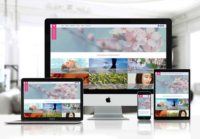
For the past several years, responsive design has become the status quo and is now an expectation in any website. If your website hasn't joined the club yet, a web redesign should be under its way and your number one priority.
How responsive your website is will influence your SEO (Search Engine Optimization) strategy and UX (User Experience), adding a responsive design to your website's budged should be imperative for a successful website.
Card designs and grid layouts are a great example. As the simplistic, organization, and flexibility of the design creates responsive effect. These layouts are particularly suitable for websites with an abundance of information.
Typography
As web designers become more focused on typography, we predict that its popularity will only increase this upcoming year and the ones to follow.
Typography can be a brilliant way to convey a certain feeling to your design, it can give purpose to a brand and their website. Typography on a website can also mean the difference between a difficult navigation, or a quick and easy one.
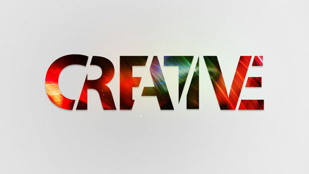
Some styles of typography include but are not limited to: big, bold lettering, custom typography such as water colours, hand-rendered and image-in-text.
Cinemagraphs
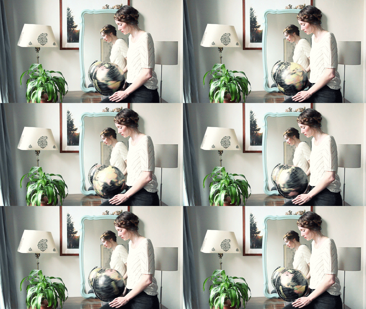
Cinemagraphs while still a growing trend can add that little something you are looking for to make your website design pop. This mesmerizing and strikingly beautiful concept is inherent eye-candy to most users.
The human eye loves motion, and video and other moving pictures have always been a particularly effective way in catching visitors' attention on a website.
While cinemagraphs can be exciting add-ons to your website's design, they can result in large file sizes, they can easily be over 3MB, so consider streaming a video instead of a GIF.
Gradients
Bright, colourful, kaleidoscopic gradients are making their big comeback on the web design scene. From flat images to background images with gradients to subtle textures. The two-colour effect is an example of the gradient trend and it's back big time. While gradients were hugely popular a few years back, this 2017 is a little bit different. Here we have a few examples of what's in this time around:
FLAT COLORS: Complimenting other current trends, these colour choice can help gradients give your design a modern feel to it. This style of gradient is great if you are mixing it with flat aesthetics or muted colours for minimalist designs.
TONED: Two-toned or also known as duo-toned gradients are a trend on their own this year. Warm tones such as orange, red, blue, and green are particularly trendy right now.
BACKGROUND IMAGES WITH GRADIENTS: Gradients are giving backgrounds with depth and realism a chance to make their comeback this year in web design. Incorporation three-dimensional aspects into the design, gradients in background images also tap into the VR (Virtual Reality) trend that is going around.
Bright & Colourful
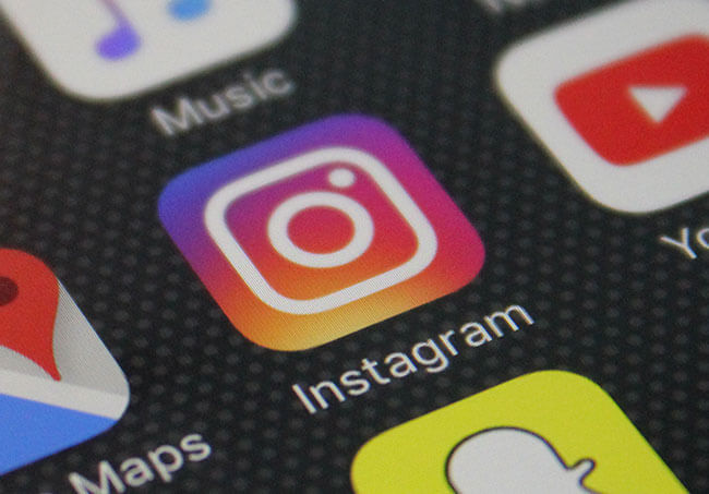
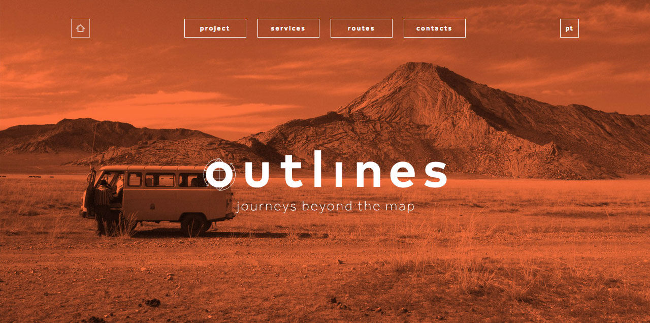
2016 was all about minimalism, but 2017 is all about colours, and bright ones at it. Companies and brands are redesigning their logos and how they present themselves. Going for bolder, brighter colours and becoming more aesthetically pleasing in the public eye. Take Instagram for example; a bright, and colourful gradient scheme took over as their new icon design.
Hand-Rendered Elements
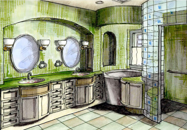
As designers and artists, we tend to doodle. These doodles can add a personal touch and make a project feel more intimate and give it a personality. Nowadays, using hand-rendered elements such as fonts, icons, graphics, and buttons have become increasingly popular as it brings a unique touch to websites. Leave the perfect, boxy, and rounded elements for hand-rendered ones and convey individualism within your website.
Experimental Composition
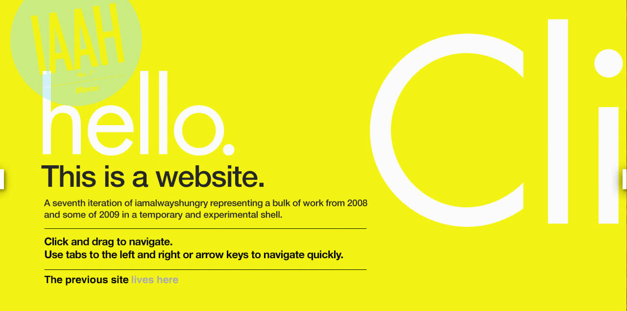
We live in a world that teaches us to be tidy and draw inside the lines. But that's just boring, wouldn't you say so? In 2017, designers are trying to break through and experiment with eclectic structures. Designers will be breaking through by experimenting with overlapping images and texts, layering to create depth, and texts placed in unusual places are just a few examples.
Summary
We live in a world that teaches us to be tidy and draw inside the lines. But that's just boring, wouldn't you say so? In 2017, designers are trying to break through and experiment with eclectic structures. Designers will be breaking through by experimenting with overlapping images and texts, layering to create depth, and texts placed in unusual places are just a few examples.
